Archives

Context Of Practice // Audience Membership.

Workshop 


- Stereotypical Students - 


  • Bad money management 
  • lazy
  • drunks
  • sociable
  • tired
  • hungover
  • unhealthy
  • irresponsible
  • promiscuous
  • tax dodger 
I scored 6 out of 10 on being a stereotypical student. 

- Identity -

  • Describe your personalty in 5 words?
  • How much do you care about your personality on a scale of 1 (least) - 10 (most)
  • what gender are you?
  • how does your history affect you now? top 3 experiences?
  • name a joke?
  • where would you take someone on a date?
  • whats your sexual orientation?
  • whats your favourite past time?
- Graphic Design Students - 

  • Care about appearance 
  • participate in active pastimes
  • straight
  • self conciseness / care what people think
  • creative
  • conventional dating
  • mixed gender
  • range of experiences
  • open and honest
  • self centred 
i score 8 out of 10 for a graphic student, which is more than the stereotypical student. 

- 10 interesting questions to ask myself in order to identify my audience membership - 

  • What is your favourite past time?
  • how many hours a day do you spend on computer?
  • do you prefer to work digitally or hands on?
  • what genres of music do you like the best?
  • how old are you?
  • do you know about the anatomy of type?
  • how much alcohol do you drink in a week?
  • how much money do you have on you?
  • what did you have for tea?
  • where do you live?
- Answers - 

  • GRFX / GUITAR / FOOTBALL
  • ON AVERAGE ( A WORKING DAY) BETWEEN 6 AND 10
  • DIGITALLY
  • INDIE/CHILLWAVE/ACOUSTIC/80's HOUSE
  • 20
  • YEAH, LOADS
  • TOO MUCH - A FEW PINTS AND A 3/4 LITRES OF CIDER
  • £5.64
  • POOR MANS SPAG BOL
  • LEEEEEEEDS CITY CENTRE
ANSWER - POOR GRAPHIC DESIGN STUDENT

- 3 Pieces of Visual communication from the public domain that i like / how has my identity informed this? -


FRED PERRY - I like the brand, like the vintage label 


FLYER/POSTER design spotted around leeds.  links in with graphic design, music i like and being a student. 


STARBUCKS - Keeps me awake - designers fuel. 


Publication Workshop

After our blog group returned back together with all of the different research, we pooled it together and decided to look at sort through some information we had gained from the exercise...

5 Things We Observed

Magazines


  1. The more expensive the magazine, generally the less infomation is crammed onto the front.
  2. The title is generally at the top of the cover
  3. Generally released weekly, monthly or quarterly. 
  4. Generally photographic imagery on the covers (except art and children based magazines)
  5. Mostly the same size format, around a4.
Books

  1. Standard size/format
  2. More formal than a  magazine 
  3. Comes in both paper and hardback copies 
  4. Title needs to stand out as its the only thing on there
  5. Made to be kept and not trow away (quality)
General Publications

  1. Generally lots of info crammed into a small space
  2. Broad range of different pieces
  3. Varied printing techniques
  4. varied sizing 
  5. no particular format 

5 Things We Now Know...

Magazines

  1. More expensive, less info on front.
  2. so many different categories for absolutely everything.
  3. Typeface conveys the context of the magazine
  4. Art magazine are more experimental 
  5. and better made quality.
Books

  1. Is digital for younger audience? lots of teen fiction
  2. So many digital versions of books and kindle
  3. Too many young people have autobiographies!
General Publications

  1. each sub catergoy has similar size formats
  2. more concious of design
  3. more design led than traditional newspapers ect. 


5 Things We Need To Find Out...

Magazines

  1. Who is the publisher? and Where?
  2. Where is it printed? what stock?
  3. More expensive, less info on front? Why is this?
  4. Stock printing?
  5. Stock type
Books

  1. Published?
  2. Printing?
  3. Stock Type?
  4. Different Layouts?
  5. Books over the interent sales against shop sales?
General Publications
  1. Published?
  2. Printing?
  3. Stock Type?
  4. How many different products fit into this catergorie?
  5. differenciate?

Evaluation, Focus, Develop

Evaluation

What is the problem?


Insufficient education and information on the history of native americans in an easy to read and understand info graphic guide for a museum. 


What subject/area of study are you focusing on?


Native Americans - Religion/Mythology, Way of life, Hunting, Clothing, Traditions (War Bonnet, Hallucinogenics, Dreamcatchers, Patterns and Totem Poles)

To what depth are you investigating this area/subject? Is this sufficient?


I have already gone into a lot of depth to find the right information i need. Reading articles, books, and information on websites to pool together all the correct and relevant research ready for me to use. I have also sourced 1000's of images as a visual bank for me to look over and look back on for influence, wherever i need it. I


What is the form and amount of your research to date?


Blogged sources - Collected material - Websites - Books and Tons of Imagery. 

What visual material do you have to work with?


I set myself a limit of at least 100 images to collect for each section but have collected more. I have looked at existing artwork, both relating the native americans and info-graphics. I have also looked at general imagery for all the separate sections i have been working on before creating my own visual imagery in the form of design sheets that have now moved on into my designs. 


Is there an appropriate amount  of work for the time you have had to develop it?


I would like to think so but i would probably say i could have done more if i had organised my time a little better. I have been very busy in other areas of the course so my full time and attention hasn't been on this. I am starting to put more hours into this project now that i am well on the way with designing. 


If there isn't why is this? How could you improve your work rate?


---


What is your timescale? When is the deadline?


The deadline is just under two weeks off, but i have booked my print slot for a couple of days before. I have planned my time appropratly in order to be ready for print, giving me a couple of days and a weekend to sort out any little bits before handing it in. 


What is achievable in the time available?


I believe that the final products that i have decided to create can be achieved in the time, that is why i chose to do this and wanted to focus my attention on it. 


What methods are you using to evaluate the progress of your ideas?


I am documenting my design ideas and checking them against my research to see if they relate and fit the general style that i am going for. I think at the moment i have got a real style that is running through my work so by checking my design ideas to see if they fit in and also against the information i am using and my research i think this gives me a good idea and way of evaluating my progress. 


Focus


What are you identifying as areas worth developing further?


maybe the format of my products. I am going to be making a booklet/zine/guide, a poster/s, and maybe stickers instead of sticking to my original plan of just postcards because i want to experiment a little bit more and have a bit of variety whilst staying under the same theme. 

What are you trying to communicate?


Educating and Informing people about the history of Native Americans, in a easy, contemporary and fun way. 


What audience have you identified?


People who would most likely visit museums really. Iv'e got to think about school children as in trips with school and family as well as an older cultural audience and try and mould something that will fit with both. 


Who are they?


Older Children - Tennagers - Adults

What problem(s) have you identified?


most of the information i have found looks dated, is presenting in a ugly, dated fashion and isn't easy to link it all together and find an learn quickly and easily. 


How do you intend to solve this (these)?


By making my set of products i want to make an easy, interactive, fun way for people to learn about this, but also make the design look contemporary and fit in within todays world.


What further research does this require? (what, where, who & when?)


I would like to get a museum visit in, but i only realised this when i got back into uni, i don't think i would have time but hopefully if i have time over a weekend. I will continue various research to keep myself on track when i'm creating. I already have a style going that seems to be working. 


What is your intention?


Educate and Inform in a easy and contemporary way. this will be through info-graphic themed postcards, posters and maybe a booklet/guide.

Development


Have you moved on from your initial starting point. If so how and why?


Yes i have, i wasn't really sure where i was going with the info graphics but when i figured what i wanted to say then i could picture in my head what everything needed to look like. This has made me change my product ideas and designs and give me enthusiasm to finish the project effectively. 


What methods are you using to document this development?


Blogging the progress of my ideas through design sheets and my work as it progresses into final pieces. 


What processes will you need to use to develop your work?


Group feedback and looking over my research and existing work to see if i am heading in the right direction. constantly experimenting with new ideas to see hoe i can fit them in to see if it will work. 


Do these processes require workshop access?


--


When do you intend to access these workshops?


--


Magazines // Current Affairs

Economy 


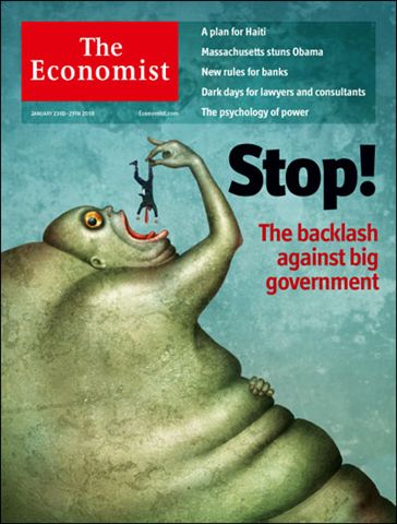
The Economist Magazine 

English News and International affairs magazine. Again, a serious magazine so the front cover often bears little type and a large image or piece of art demonstrating the current affairs. The logo looks buisness like and proffesional and is also quite different from other magazines. The white text in white box. 

Politics


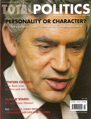
Total Politics Magazine 

Total Politic is a british politics magazine described as a a lifestyle magazine for the political. Quite a serious magazine that tackles serious issues. Standard Helvetica font used, but also quite vibrant for such a serious topic. 


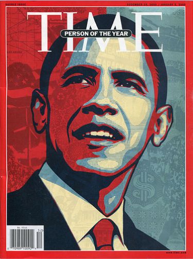
Time Magazine 

Time is an iconic american based current affairs magazine and weekly new magazine. Time is the world's largest weekly news magazine, and has a domestic audience of 20 million and a global audience of 25 million. The look is simple but instantly recognisable. Traditional serif red font with a red border. The image on the front often bears a large portrait of a celebrity or icon. 


MACLEAN'S Magazine 

Maclean's is a canadian weekley news magazine, reporting on issues such as current affairs, pop culture and current events. Quite a serious tone to the magazine and the design of this reflects this. The font used is bold and clean and theres no real gimmicks, bright colours or taglines around the front cover. 


PRIVATE EYE Magazine 

Comedic take on current affairs, mainly politics edited by Ian Hislop. The design on the cover looks a little bit amateurish to me but then again, this is probably the look they are trying to achieve.  Tacky fonts and garish colours. 


Politics Magazine 

American politics magazine tackling serious issues. Again the font is quite formal, the serif fonts are quite a popular choice for serious topics like this. 


Magazines // The Arts

Design 


GRAFIK Magazine 


Elephant Magazine 

Photography 


125 Magazine


Pop Magazine 


Love Magazine 


I-D Magazine 


Illustration 


Illustration Magazine 


Collect Magazine 

Fine Art


Fine Art Magazine 


Fine Art Collector Magazine


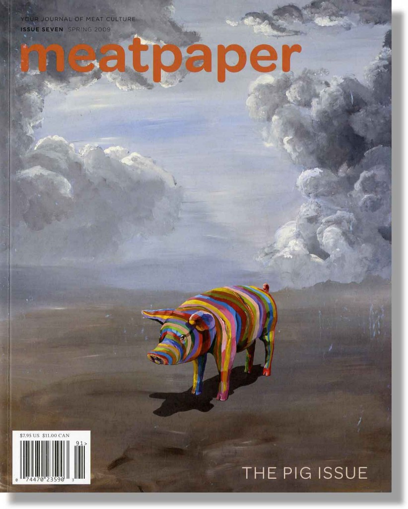
Meatpaper Magazine 

Sculpture 


Sculpture Magazine 


Digital 


Computer Arts Magazine 


Digital Arts Magazine 


Critique 


Creative Review Magazine 


Art Review Magazine 


Copyright 2010. All rights reserved.

RSS Feed. This blog is proudly powered by Blogger and uses Modern Clix, a theme by Rodrigo Galindez. Modern Clix blogger template by Introblogger.