What skills have you developed through this module and how effectively do you think you have applied them?
I feel this module has been a real benefit to me throughout the course of the year. It has helped me understand where i am as a designer and where I want to be. I think the main thing i have taken away from the module is making lists. Constantly questioning myself to why I am here, how much I have learnt so far, and what I still need to learn. It's good to look back across the year and to see how I have progressed, but this would be pointless if I wasn't to challenge myself even more and learn new skills and techniques.
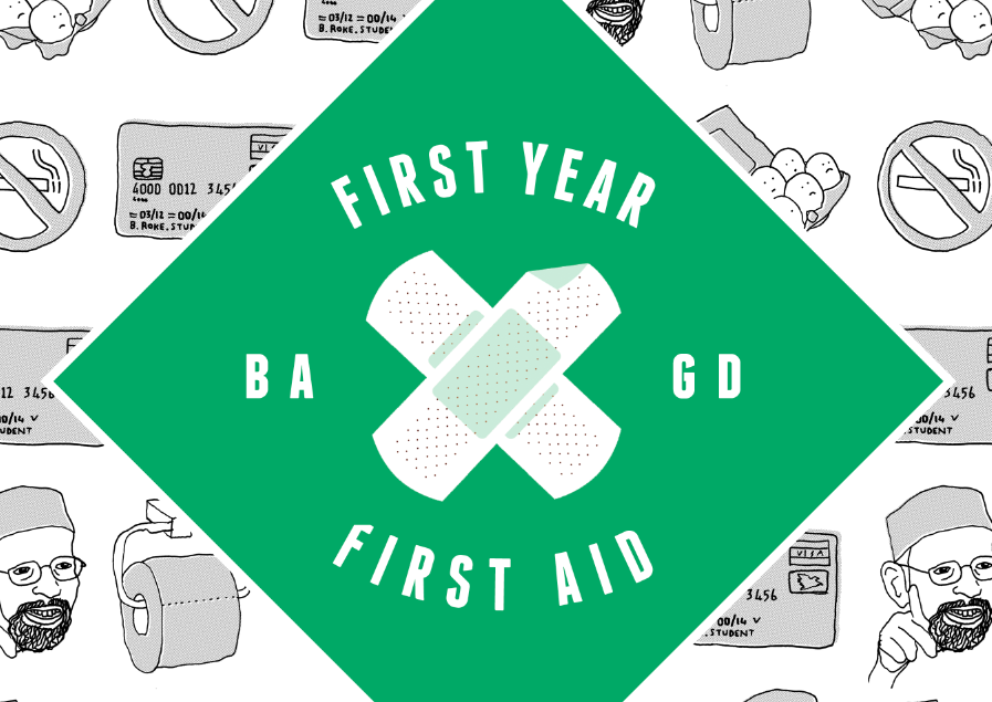
'Speaking From Experience' is one of the briefs that i have enjoyed the most while on this course. It was a chance really to sum up the entire year and bring in all the skills that i have learnt in and outside of uni and merge it with my initial experience of Leeds and the experience of other students which was good to be able to do.
Time management is another big thing i have taken on board this year, and tried to improve with some great results. When i think back to how unorganised i was at the start of the year, it's clear to see that the workshops throughout this module have helped me manage my time by looking at my daily routine from an outside perspective which has helped me pin point where I am wasting time, where i should be working and also where i shouldn't be working, and adding in breaks and time to relax.
As for the InDesign brief, from the initial workshops we had, my layouts skills were pretty mediocre but I have now began to use InDesign more and more for any type of layout piece that I am working on and this is getting me more comfortable with the software and therefore improving my skills within it. For the last module, I worked pretty much entirely in InDesign to create a 44 page publication and without the skills I learnt here, I would not have been able to do that before.
John's tutorials have really helped me to see another side to presentations and how i can plan and rehearse a presentation to keep the audience entertained and even amused by adding a comical element to it. This has helped me when putting together my presentation but we'll have to see how I do on the day, hopefully the nerves wont get the better of me.
What approaches to design production have you developed and how have they informed your design development process?
I think by reflecting on a body of research that informs my practise has helped me progress through the module and year. It's good to look back on research and responses to set tasks to see where my influences and ideas was coming from at that time and also to review this and see how i have changed over the course of the year.
During the 'Speaking from Experience' brief, i thought much more about the concept and production of my product. I think that by focussing on the concept, product, range and distribution of my idea, it was a good way to view the product in a real life situation and therefore design for a purpose. Also during this brief, I experimented more with hand-drawn. It is something that has been raised in some of my crits to experiment with because i'm very into heavily driven type and image pieces of work. I thought i would try a different field that i am not as familiar with and i think that most people on the course are scared to create simple almost 'child like' illustrations. This brief was perfect for me to experiment this way as it was targeted to graphic design students.
What strengths can you identify in your work and how/will you capitalise on these?
A strength i can identify in my work during this module is the initial concept of a product. I feel that this is the most important thing now and is something i consider well before thinking about the design of the final piece.
I think by thinking outside the box, on the 'Speaking from Experience' brief, i was able to link the 'First Aid' element into the experiences of the first years. By doing this, hopefully the product would stand out above other things because it might look out of place, like pharmaceutical packaging, but also relate back to the initial problem of helping and giving aid to the first years.
I think in future, i will capitalise on this by thinking through the initial concept in relation to the brief before i start to design.
For some reason, during this module i haven't found myself panicking to get things done like in previous ones. Maybe it's because it has been running all year and i have been updating and progressing as i go along. I hope that i can be more relaxed and into a more natural rhythm in future briefs, as i feel my design and ideas come easier when i am not stressing.
What weaknesses can you identify in your work and how will you address them in the future?
Presenting is still a weakness for me just because the nerves tend to get the better of me. I will try to work on this by practising my PPP presentation as much as i can before the final day. I will also try to stay as relaxed as i can in the build up to the presentation, so then hopefully i can relax when speaking in front of a large group.
I feel in the crits i could always improve what i give to the group. I feel that i do give substantial feedback to everybody but there is always more i could be doing to help the peers in my class get the best out of there work as well as obviously pushing to strive for the best in my own work.
I have also been criticised in the past for having too much documentation on my blog. People have mentioned to me that i should maybe just highlight key changes so i have tried to be more selective with what i put onto my blog and hopefully during this module, i have still achieved the full development of my blog whilst there not being too much content on there.
Finally, the finished piece for 'Speaking From Experience' could have been much better. As there has been trouble trying to get a print slot over the last few weeks, I just couldn't get into the print room, not even in the drop in sessions. This meant that i had to print the hot-dog booklets in the mac suite on the standard stock which is something that i really didn't want to do. I wanted to print onto and off-shite thicker gsm paper. The box also was printed on a different printer to the laser-jet, therefore, the green has come out a different colour which isn't great. All in all, a bad printing experience and something that I will have to consider on other briefs when times are busy.
Identify 5 things you will do differently next time and what you expect to gain from these?
- Time Management - Overall this has been really good this module but in the 'Speaking From Experience' brief, the print room was fully booked up therefore the quality of my final prints was pretty bad. I need to manage my time and plan things much earlier in future.
- Digital Experimentation - Usually i have tons of design sheets and digital development for my briefs but the idea for this one seemed to hit me like a lightbulb moment so i wanted to move into designing as soon as i could. I still did a reasonable amount of design sheets, but i need to consider digital experimentation more especially with colour schemes which was mentioned in my crit.
- Expand my knowledge of printing techniques - I really need to get comfortable with screen-printing and letterpress so i can include this next year. I want to work with it as much as i can next year and make the most out of the facilities.
- PPP - maybe put more work onto my PPP that inspires me. I find myself blogging lots of different inspirational artists and other things to my personal tumblr just as a habbit and the ease of it. But i need to start adding as much content and even more to my educational blogs (PPP)
- Concept - I think i will work much more on the ocncept of my work next brief. This seemed to work well in the 'Speaking From Experience' brief when i used the product, range and distribution and branded my product.
Attendance: 5
Commitment: 5
Quantity of work: 3
Quality of work: 4
Contribution to the group: 4